
This page and its sub-pages are here to demonstrate the types of navigational links you can have on your site.
A website normally has a number of "main" pages. These pages are reached by clicking on the main links at the top of the page. When you are on the main pages on this site, we also allow you to select sub-pages of each main page by providing a set of drop down links.
Try browsing the pages under this main page to see alternative methods for your links!
To get a real feel for how each type of navigational links, use the links below to temporarily change the type of links for this whole site. Eventually the site will return to the default link style or you can reset the style here.
You may choose from the following styles. Once selected, read about the features of this style, then try looking at other pages. Drilling down the "Navigation" set of pages will help you see the effects of each style.
- Main Links on top with dropdown menus
This is the normal layout for this site. There is a single set of navigation links at the top and any sub-pages become visible as dropdown menus.
- Main Links on top with DropBox secondary menus
This layout lists the main navigation links in a row at the top and the next-level down for the selected main level page tree selected. Third levels are a drop-down menu of the second level. What makes this unique is that hovering over the main links causes a large box to appear just below the top level links. Links for the next level down for that particular main link are shown in the left of this box and a descriptive content area is on the right. Use this to describe each of your main page content areas.
- Main Links as fancy text on top with dropdown menus
This is like the normal layout for this site. There is a single set of navigation links at the top and any sub-pages become visible as dropdown menus. The links however are fancy text replacements for the normal layout which only can use fonts the browser might have.
- Main Links as buttons on top with dropdown menus
This is like the normal layout for this site. There is a single set of navigation links at the top and any sub-pages become visible as dropdown menus. The links however are gel buttons with a sheen that are auto-generated on the server and do not require a photo editor to create. The color, roundness of the corners, font, shadow, and even the crunch you see on the selected button are all customizable and generated on the server.
As you can see we had some fun with the styles. The selected button isn't shadowed giving the appearance of being depressed onto the page, and then we can optionally play around with the text. For the selected button, we "imploded" the text to give an impression of a plastic gel button that is crunched-in. Many other effects are possible!
- Main Links on top with sub-page links appearing as rows under main links
This alternative link style features the main navigation links at the top. If the selected page has sub-pages or is a sub-page itself, additional "secondary" link rows will appear below the main row at the top.
- Main Links on the left side with pop-out menus and breadcrumbs
Notice that this style has the main links stacked vertically on the left side. Sub-page links are displayed as a "pop-out" menu when you scroll over the main link.
Notice also that for this layout we have included what is called a "breadcrumb" link set at the top. Breadcrumbs are intended to show you the current page and its ancestors, permitting you to go "up" in the page tree to any level including the home page.
- Main Link Buttons on the left side with pop-out menus and breadcrumbs
Notice that this style has the main links stacked vertically on the left side and the links are gel buttons that are automatically generated on the server. Sub-page links are displayed as a "pop-out" menu when you scroll over the main link.
Notice also that for this layout we have included what is called a "breadcrumb" link set at the top. Breadcrumbs are intended to show you the current page and its ancestors, permitting you to go "up" in the page tree to any level including the home page.
- Main Links on the left side with pop-open menus and breadcrumbs
Notice that this style has the main links stacked vertically on the left side. Sub-page links are inserted for the current page by "popping open" the main links and placing indented sub-links.
Notice also that for this layout we have included what is called a "breadcrumb" link set at the top. Breadcrumbs are intended to show you the current page and its ancestors, permitting you to go "up" in the page tree to any level including the home page. The breadcrumbs in this layout are redundant because the pop-open links also provide your view the ability to go up the tree.
- Retro TV Set layout with links popping out to the left
The main point of this page is to show you that the links CAN be placed elsewhere, such as two rows of buttons on the right of this retro TV set. Sub-page links are made to pop out to the left.
- Main Links on top with dropdown menus PLUS sub-page links also on left as pop-open menus
This layout demonstrates that you can have the main page links on the top, for example, and if a page is selected that is a sub-page or has sub-pages, those sub-page links will appear on the left side.
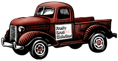
For fun we have made this layout mimic the look of Fred's Used Websites. The fact that the top menus also have dropdowns isn't necessary and is somewhat redundant with the pop-open links on the side.
- Main Links and Header at the top with sub-page links popping up.
This last layout simply shows that you can flip the whole page, with the main navigation and header on the bottom. For this one, instead of having the sub links drop down, they pop-up.